An iPad app that allows older adults to be connected to their loved ones
and their community with unified and simplified interactions.
Why?
I want to build this app for my grandma. She was the glue of the family.
But now, we are far away and use new technologies to communicate, she is left out of the conversations. I realized this does not only happen in my family so I want to create a communication tool that will allow them to be reconnected to the world.
Older adults want to stay connected and informed.
Current technologies are often challenging to use. Ohana offer them an easy way to reach out to others and access the information they need.
Features
“I’m most confident when I use my voice.”
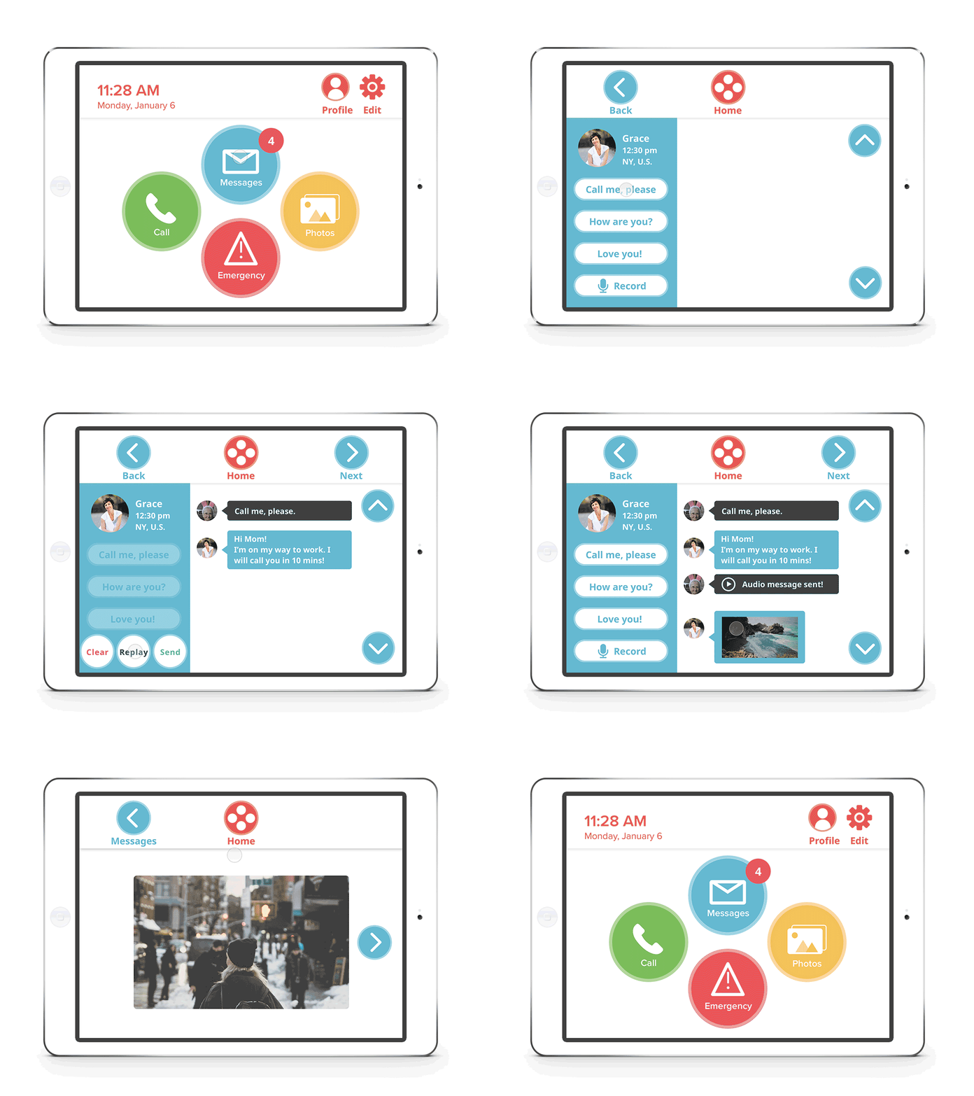
Quick access to contacts with large imagery and easy to read text.
“I can see my grandkids’ new photos any time!”
Auto saves pictures from family and friends so that our older adults can stay involved in their loved one’s lives.
“I always wait for my kids to call but now I can just send a quick voice message without disturbing what they are doing.”
Allows users to take initiative with preset messages and voice messaging.
Displays the contact’s time zones.
“We didn’t know my grandpa had a heart attack and was brought into the hospital until he was released a week after.”
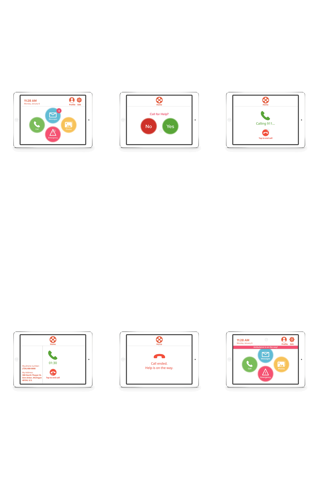
When 911 is called, everyone in their emergency contacts are automatically notified via
Process
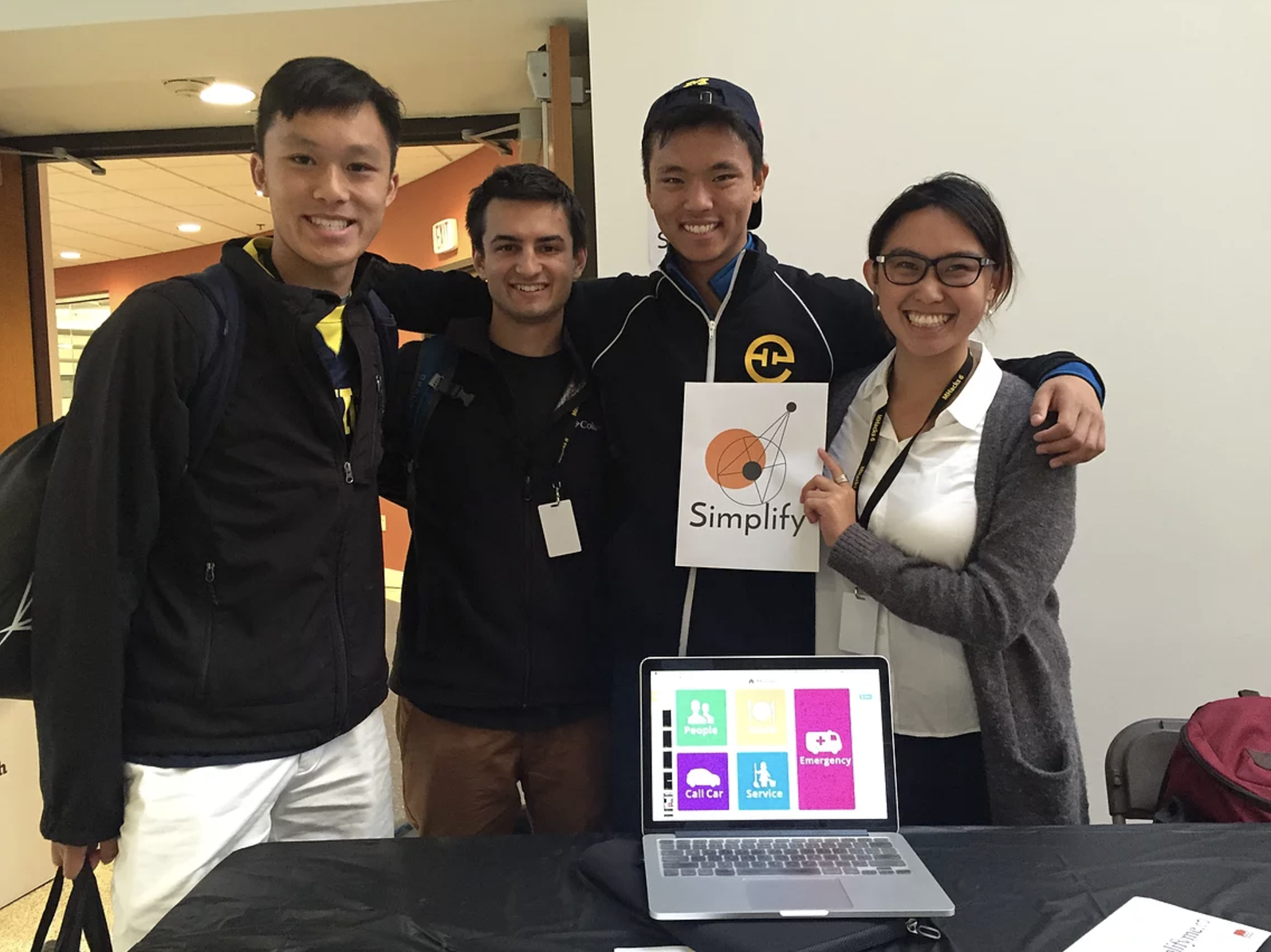
Ideated + Wireframe + Prototyped at a weekend-long hackathon (MHacks6).
Conducted Interviews and Usability Testings with target user and caretakers.
Competitive Analysis
Created Prototype 2 with focus on communication since we found out communication module is the most important feature for our target user.
Conducted usability testing with older adults who are 75+ years old. People in nursing home (Atria Assisted Living) and senior resource center (Turner Research Center)
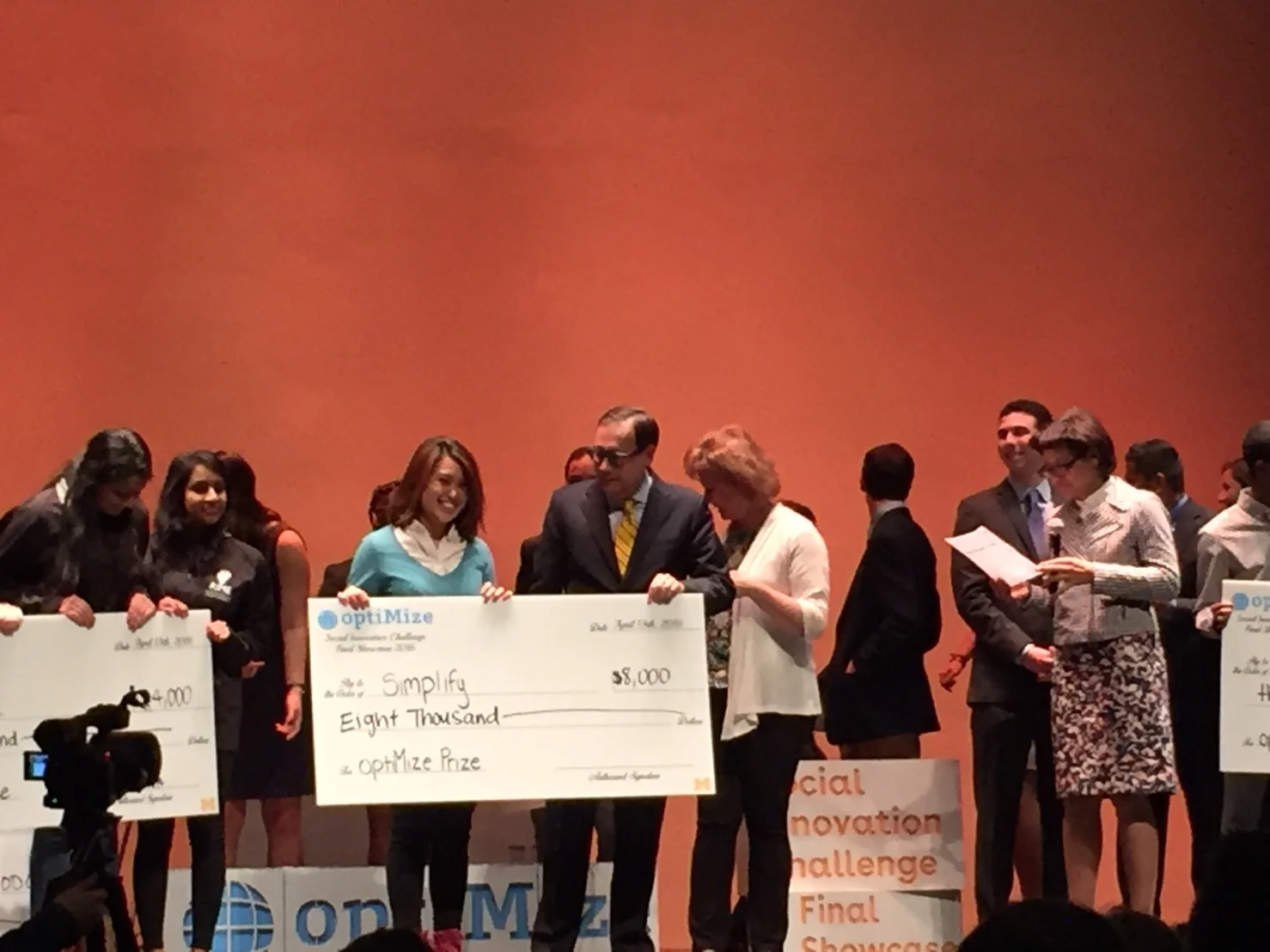
Entered and won a social innovation contest (optiMize)
Refine the design and worked with developers
Prototype 1 at MHacks 6
I collaborated with friends who are studying computer science and psychology. I was responsible for the UI/UX design and branding.
This first prototype had multiple features: communication, ordering food, calling a car, service, & emergency calling. These were the features we thought would be useful to the elderly. I realized I really needed to talk to our target users, people 75+ years old if I wanted to bring this product to market.
Interviews
We found that communication was the most important feature to our users. Other features prove to be helpful and beneficial but we decided that to start of, we would just launch with communications.
Competitive Analysis Criteria
Emotional comfortability:
Poor: The users feel scared, confused, and impatient while using the product. The retention rate for users are low and users do not want to use the product again because it is frustrating.
Average: The users feel at ease while using the product but it does not convince or draw the users back to the product.
Excellent:The users feel at ease and rewarded when using the product. User has this excitement to use this product again.
Quality of the features
Poor: Does not address the needs of the target users and their caretakers. The features are superfluous and ineffective.
Average: Address the needs of the target users but the execution of the details are lacking.
Excellent: Fully address the needs of the target users and their caretakers. Great executions on the details and realizing the nuances of how each feature performs.
Easiness to Set Up
Poor: Onboarding is difficult and confusing. External setup such as wifi and other systems is time consuming. Multiple layers of barriers. The Elderly cannot set up the product by themselves. Lots of unpredictable factors that prevent the service to be used.
Average: Onboarding is straightforward but with some confusing elements. External setup is doable but could be more intuitive and less time consuming.
Excellent: Onboarding is clear and intuitive. All the setup are self containing without any extra hassle.
Price
Poor: The price is not affordable to most target user. The price does not match the quality of the features and services.
Average: The price is affordable but does not match the quality of the product.
Excellent: The price is perfect reflection of the product’s quality and is affordable to target users.
Familiarity
Poor: The interaction is not aligned to what the target user’s that are used to. The learning curve for the product is too high and inconsiderate.
Average: The interaction is catered to the target user’s needs and habits. Some features or interactions are not intuitive to the users.
Excellent: The interaction is intuitive to the target users and effectively enable the users to conduct the product.
Navigation flow
Poor: The product lacks a cohesive information architecture. Information does not have clear hierarchy. No clear call to actions or cues that lead the user through the process.
Average: the product has a structured information architecture. The Secondary and tertiary navigation items are related to parent elements but there may be multiple items that lack connections. The call of actions are not very clear or mislead user to unintended destinations.
Excellent: The information architecture is highly cohesive. Information is structured with a clear understanding of user goals. Everything has a logical place within the architecture. Clear and effective call of actions and cues that leads the user to the right place.
Terminology & Labeling
Poor: Terminology and labeling is inconsistent, confusing, or inaccurate. Different terms are used to represent the same concept. Some terms may not adhere to a common understanding of their meanings.
Average: Terminology and labeling is consistent but could be more intuitive. Some unnecessary terminology or uncommon terms are used.
Excellent:Terminology and naming is both intuitive and consistent. Terminology is precise and appropriate with the context.
Usability Testing Participants at Atria Assisted Living
Katie (Director/ Care-taker)
Carol (Poor eye sight & use computer for emails)
Larry (Hard of hearing)
Dolores (Short-term memory loss)
Margery (Arthritis)
Sue (Sensitive with the topic of family)
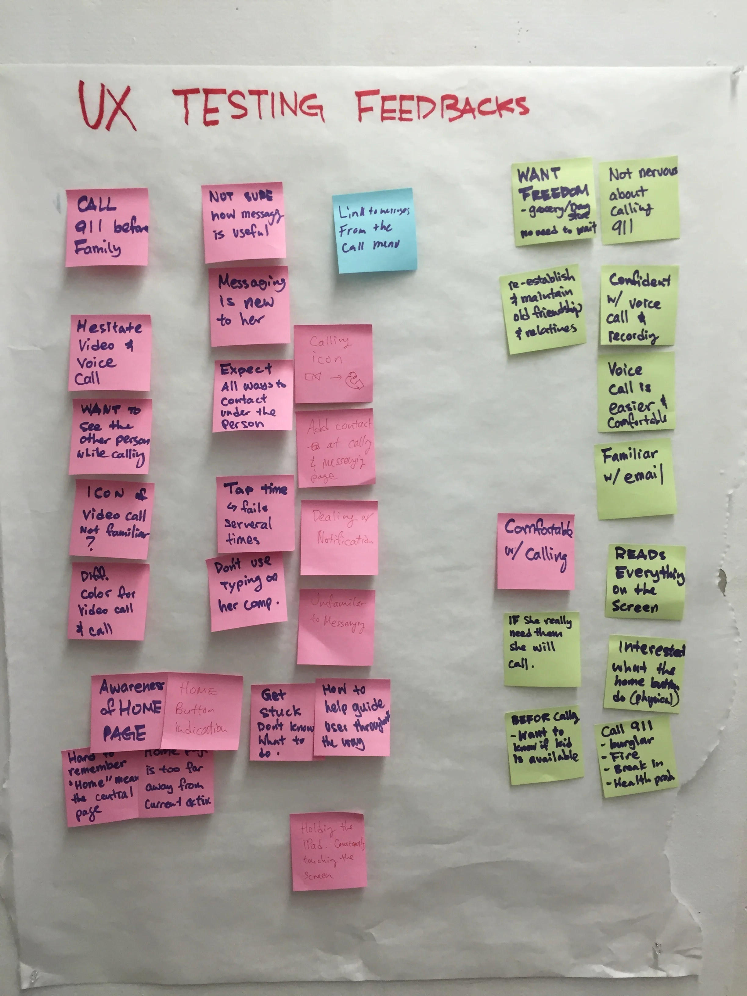
Synthesizing Data from Usability Testing
Elderly read everything on the screen
Users wishes for more freedom
Good Readability
No concept of home page
Home button is unclear
Need Instructions
Organized using function v.s. contacts
Detailed feedback for each feature & possible solutions
(The image on the left shows the categorized feedback for each feature.)
After synthesizing the data, we found out that our main problem is navigation due to inconsistency of user interface elements. First we had to set up a grid for each module to follow and define the criteria for the form.
Winner of optiMize: Social Innovation Challenge
I took part in a year-long competition, which I went through levels of challenges such as conducting market research, showcasing product developments, and developing business model. Every two weeks we have workshops to work with mentors then report our progress to the judges. At the end of the year, every team presented their project in front of a panel of judges then they picked few teams with potential to receive the grant. The winning teams presented our projects in front of 500 people in the auditorium and accept our grants.
Communication with Developers
We exported all assets for the developers and created animations in Principle to demonstrate how we wanted transitions and movement to work in the app.
Used Trello to give feedback and keep track of the progress of the app during development
After getting the Testflight builds, we took screenshots of the pages that needed changes and marked up the details of what to change.
